When Allergen Icons Create More Risk
Allergen icons promise safety but often create false confidence. Here's how your menu design might be putting guests at risk during busy Friday night service.
The False Confidence of Little Symbols
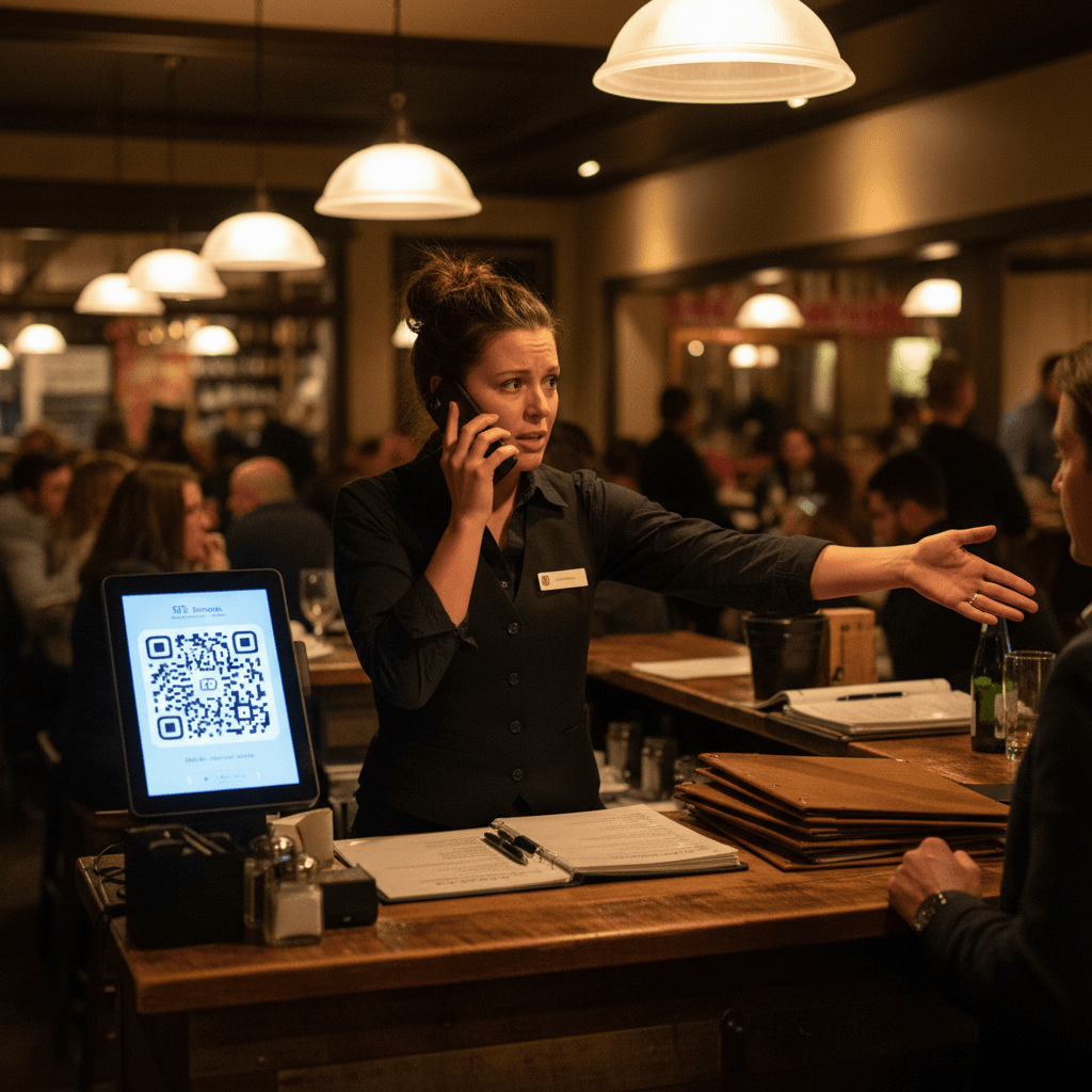
When Allergen Icons Create More Risk, it happens on a Friday night at 7:45 PM. Your server is in the weeds with a six-top. She glances at the menu, sees the little "GF" icon next to the salmon, and assumes safety. She doesn't ask the kitchen about the shared fryer for the side of potatoes. She doesn't check if the sauce contains soy. The little symbol gave her a mental shortcut, and that shortcut almost sends a guest to the hospital. Visual shortcuts create mental shortcuts for your staff. They stop asking questions because the menu appears to have answered them already.
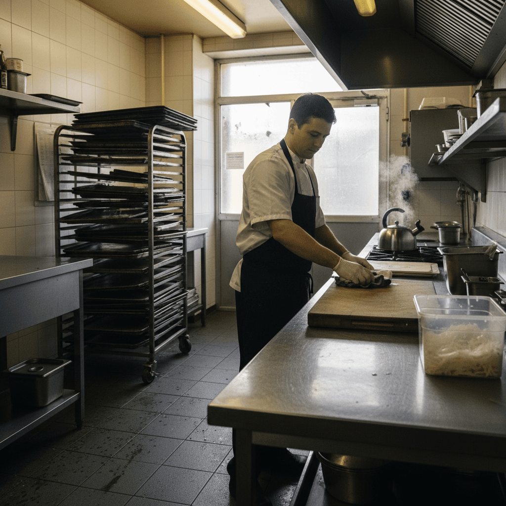
The gap between printed symbols and kitchen reality widens during peak service. Line cooks are focused on fire times, not deciphering tiny icons. Prep cooks from the morning shift might have used the same cutting board for nuts and vegetables. The fryer oil hasn't been changed since lunch. None of this is captured by a static symbol printed three months ago. Your menu becomes a liability, not a safeguard. It creates a false layer of confidence that collapses under the pressure of a real rush.
This is why treating allergies as just menu notes is dangerous. For a complete system that protects guests from the kitchen out, not just from the menu in, read our guide Allergen Safety: Beyond the Menu Card. It builds the kitchen-first process that icons can never replace.
Why Standardized Icons Fail Your Kitchen
The hard truth is simple: more icons don't mean more safety. They create checklist thinking instead of situational awareness. A server sees a "D" for dairy-free and mentally checks a box. They don't consider that the vegan burger patty is grilled on the same flat-top as the cheese-filled omelets from brunch service. The icon says one thing. The kitchen line tells a different story every single shift.
You need to audit your current icons against actual prep stations and line cook knowledge. Walk through a typical Saturday service from open to close. Where does cross-contamination actually happen? It's not in the recipe card. It's in the reality of your kitchen flow.
Specific examples prove this point every day. Dairy cross-contamination lives in your fryer where mozzarella sticks and onion rings share oil. Nut dust settles on your dessert plating station from the lunch service's baklava. Gluten hides on the knife used to cut focaccia before it slices the gluten-free cake. Icons never capture these moving targets. They are snapshots of an ideal world that doesn't exist during your dinner rush.
The Rule: An icon must represent a guaranteed process, not just an ingredient list. If you cannot guarantee the process from receiving to plating, the icon is a lie.
When Your Menu Becomes the Bottleneck
This false confidence creates operational drag. Watch ticket times slow as servers double-check every icon during Saturday dinner rush. They're not talking to guests or running food. They're squinting at laminated cards, trying to remember if "V" means vegan or vegetarian this season. The menu has become a reference manual instead of a sales tool.
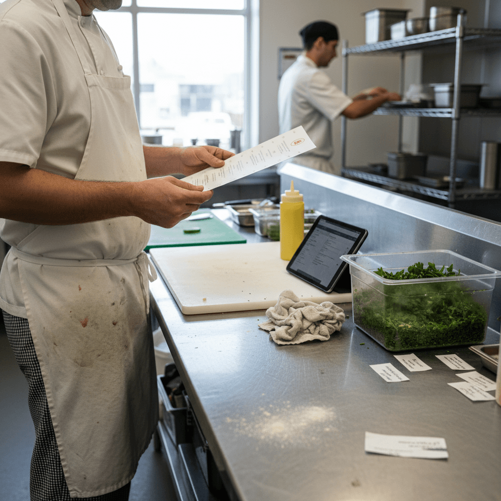
You'll hear expo calling back to the line three times about gluten-free modifications because icons created assumptions rather than questions. "The menu says GF!" expo shouts. The sauté cook replies, "Yeah, but the prep guy dusted the chicken with flour this morning by mistake." The icon promised something the kitchen couldn't deliver in that moment. Now you have a delayed ticket, an angry guest, and a server stuck in the middle.
Menu redesigns every season break staff training momentum completely. You spend two weeks training everyone on the new symbols and their meanings. Then a veteran server quits, and a new hire has to decode your hieroglyphics during their first Friday night shift alone. The system relies on perfect institutional memory, which is impossible in hospitality turnover. Your beautifully designed menu becomes a knowledge silo that leaks with every staff change.
Building Menus That Actually Work
The solution is to design menus that prompt conversations rather than end them. Your menu should be a starting point for dialogue between server and guest, and between server and kitchen. Instead of a tiny "tree nut" icon, use clear, simple language that forces engagement: "Please alert your server to any nut allergies." This phrase does the work for you. It triggers the server to ask the necessary questions and flag the ticket appropriately for the kitchen.
Connect this back to a kitchen-first system by integrating allergen notes with daily prep sheets and line checks. During the 4 PM line-up, don't just talk about specials. The chef must verbally announce any allergen risks that day: "The fryer is contaminated with fish from lunch specials," or "We're using shared equipment for nut desserts tonight." This information gets written on the prep board in expo view. Now your servers have real-time, shift-specific data, not outdated symbols.
Train servers on three open-ended questions for every table: "Does anyone have any allergies or dietary restrictions we should know about?" "Is anyone avoiding dairy, gluten, or nuts?" "How severe is the allergy?" This script takes 10 seconds and gathers more accurate information than any icon grid.
Test new menu designs during slower lunch shifts before weekend rollout. Print prototypes and have your servers use them with real tables during Tuesday lunch service. Watch where they get confused or where conversations break down. Refine the language based on what actually works on the floor, not what looks good in a graphic design program.
Manual processes like these build muscle memory and situational awareness that icons destroy. They require discipline and consistent reinforcement from management during every pre-shift meeting.
Modern digital tools can automate the repetitive parts of this workflow once your manual system is solid. Kitchen display systems can highlight allergen tickets in red as soon as they're fired. Digital ordering platforms can prompt guests with clear allergy questions before they even place an order. These tools enforce consistency where human memory fails. But they only work if they're built on top of clear kitchen processes you've already established manually. Technology solves residual pain; it doesn't create safety from nothing.
Taking the Next Step
Shifting from symbolic safety to procedural safety is practical work. The logic is clear: icons represent promises your kitchen must be able to keep during actual service. Building that capability happens through daily habits, not seasonal menu redesigns.
If your current menu design is creating more risk than it prevents, it's time for a change that starts in your kitchen line-up. You can view our pricing for tools that help enforce these critical conversations at scale. To see how integrated systems support safer service from order to plate, start a free trial and test it during your next quieter shift before rolling it out for Saturday night