Menu Layouts That Actually Sell Food
Your menu design is costing you money. Learn where customers' eyes go first and how to guide them to your most profitable dishes.
Why Customers Always Order Your Cheapest Dish
Menu Layouts That Actually Sell Food start with understanding a simple, frustrating truth. You watch your servers point to the specials, describe the chef's favorite dish, and still hear "I'll have the house salad" from half the table. The problem isn't your food - it's where you placed it on the page. Most menus accidentally hide profitable items in dead zones where eyes never travel. During Friday dinner rush, watch how servers point to specials versus how customers actually order.
The disconnect happens in the first 30 seconds a guest opens your menu. Their eyes follow predictable paths, and if your highest-margin steak is buried in the middle of a dense paragraph on the bottom left, it might as well not exist. You're fighting human biology, not taste preferences. This is one piece of a larger system for building a profitable menu, which we break down in our guide on Menu Engineering: The Real Math Behind Profitable Plates.
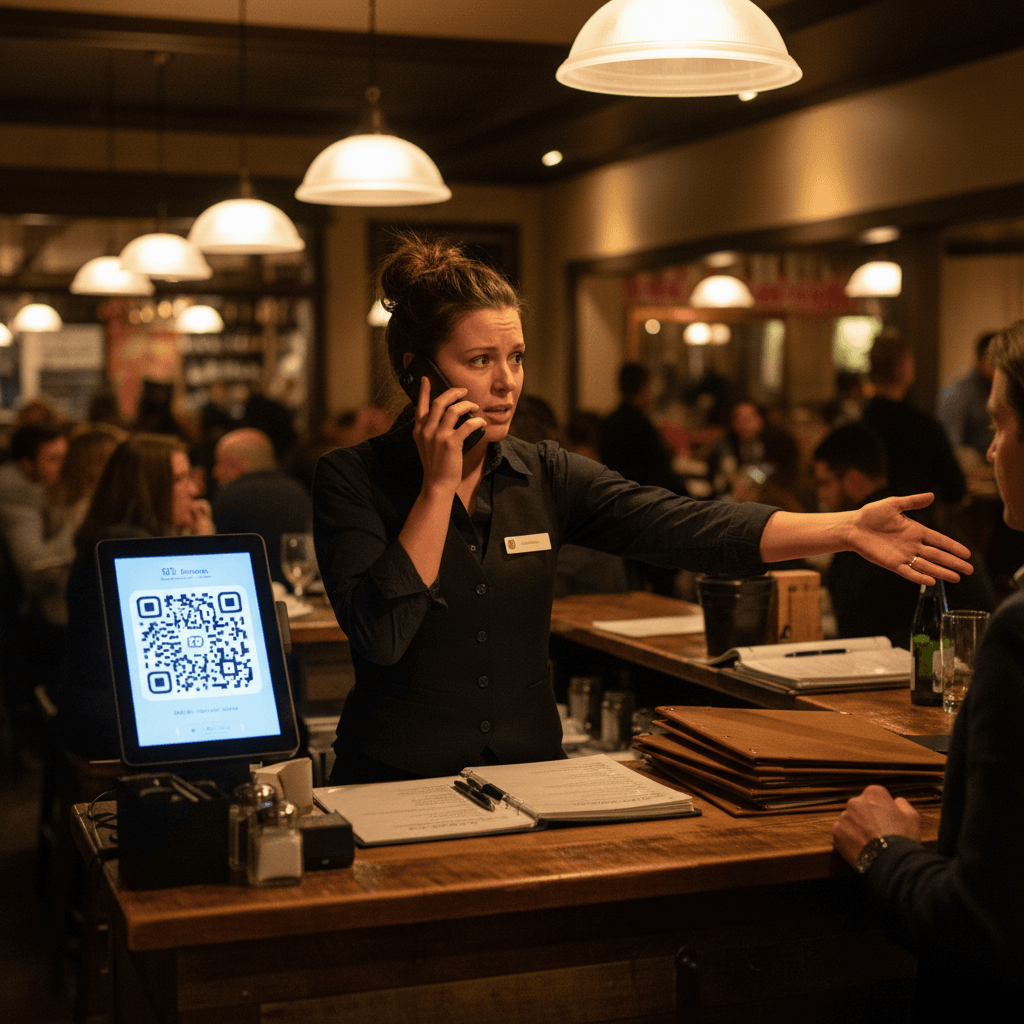
Think about your last busy Saturday night. The expo is calling three orders at once, and every ticket seems to be for the same two low-profit items. You know you have better dishes, but they're not moving. That's a layout problem costing you real money every shift. The fix isn't more descriptions or fancier fonts. It's placing dishes where people already look.
Place Profit Where Eyes Naturally Travel
Hard truth: Fancy graphics don't sell food - strategic placement does. Start by identifying your four most profitable dishes. These get prime real estate in the upper right quadrant of each menu section. Use simple boxes or subtle shading, not distracting artwork. For appetizers, place your highest-margin item at position three in the list - not first.
Customers read menus like they read books in English - top to bottom, left to right. Their eyes naturally start at the top left corner of any section, scan across to the right, then drop down to the next line. The upper right corner of that first visual block is where attention naturally rests before moving down. That's your golden spot.
The Rule: Your most profitable item in any category must occupy that upper right position.
If your best-selling pasta also has your best food cost percentage, it belongs there. If your most profitable item is a slow mover, you still put it there and train your staff to mention it first. During lunch service, watch how people's fingers trace the menu as they decide. You'll see the pattern - they touch the top items first.
Use visual cues that guide without shouting. A simple shaded box around one item per section works better than five different fonts or colors. Too much decoration creates visual noise that makes everything blend together. Your goal is to create clear pathways to profit, not win a graphic design award.
When Pretty Menus Still Don't Work
You've moved items around, added boxes, highlighted specials. But sales patterns don't change because you're guessing about customer behavior. Without tracking what people actually read versus what they order, you're rearranging blind.
This happens when you design based on what looks balanced or aesthetically pleasing rather than how people use the menu during service. You might cluster all your seafood together because it "makes sense," but if seafood lovers only represent 20% of your dinner crowd, you've wasted valuable real estate.
Watch what happens during Sunday brunch versus Thursday dinner. Different crowds use menus differently. Families with kids scan for familiar items quickly - their eyes jump around looking for keywords like "burger" or "pasta." Couples on date night read more slowly, considering descriptions and prices. Your layout needs to work for both patterns simultaneously.
The most common mistake is treating every section equally. Your appetizer section might need three clear profit leaders because people order multiple apps to share. Your entree section might only need one strong anchor dish because most guests order one main course. Without data on ordering patterns by party size and time of day, you're designing in the dark.
From Layout Guesswork to Sales Data
Stop designing menus based on what looks good. Start testing layouts with real customer data. Track which items get ordered after menu changes, measure how long people spend reading different sections, and watch for patterns during different dayparts.
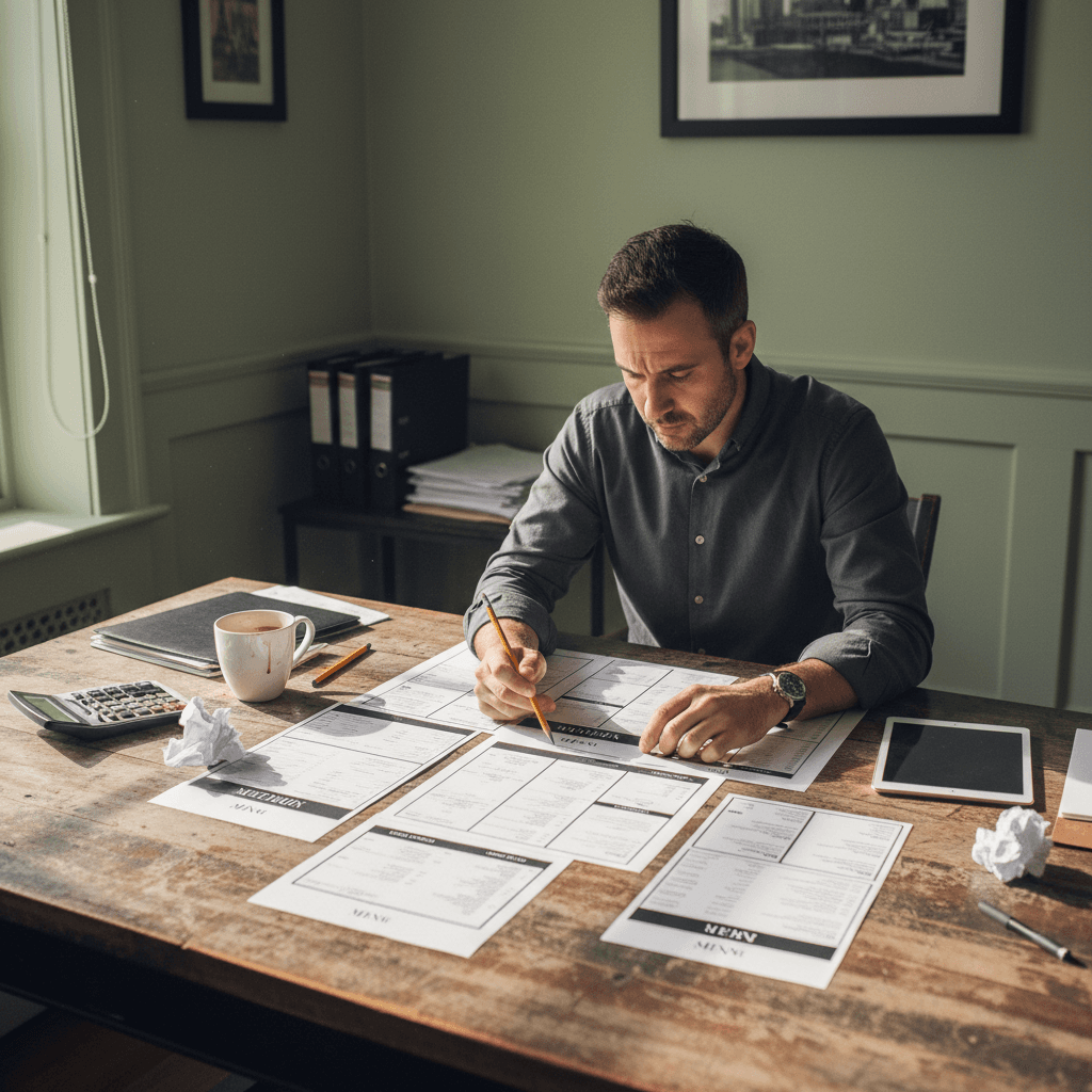
Begin with a simple two-week test during your busiest service periods. Print two different menu layouts for Friday and Saturday nights - same dishes, different placements. Have servers alternate which version they give to each table and track what gets ordered from each menu type. You'll see immediate patterns emerge without expensive research.
Look at your point-of-sale reports through a new lens. Instead of just seeing what sold most, look at what sold together and when. If your profitable salmon always sells with a specific appetizer but rarely with desserts, that tells you something about how customers build their meals from your layout.
The Rule: Test one change at a time and measure for two full service cycles before making another adjustment.
If you move your steak from position four to position one in the entree section, wait through two busy weekends before deciding if it worked. One slow Tuesday doesn't tell you anything meaningful. During these tests, ask servers for their observations - they're on the front lines hearing customer questions and seeing hesitation points.
This manual approach works but requires consistent discipline and time that many operators don't have during busy seasons. Modern restaurant technology can automate this tracking by connecting ordering data directly to menu item placement analysis, showing you exactly which layout drives the most profit without manual spreadsheet work.
Taking the Next Step
Menu layouts that sell are built on observable patterns, not guesswork or aesthetics alone. The logic is clear once you start watching how real customers interact with your menu during actual service hours.
To implement these changes effectively across all your dayparts and menu types requires systematic tracking that goes beyond manual observation alone today's digital tools provide that visibility instantly so you can focus on execution rather than data entry see exactly how different placements perform with view our pricing options or start a free trial to test these principles during your next busy weekend service